
Basic Geometry
 The first part of a rendering engine is to transform 3D vertices into a 2D plane. Once I did that for a polygon, I needed to fill in the polygon with pixels. This was done by looping over the bounding rectangle of pixels, and coloring those pixels which are calculable internal to the three points. This is-internal calculation was initially flawed, and failed on triangles with vertical sides.
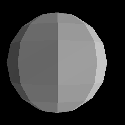
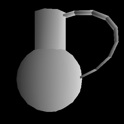
 Once I got the is-internal check working, I adapted a DXF parser, and wrote a script that converts a parsed DXF file as created in the Source SDK Hammer editor. This gives me the ability to import much more complex shapes, and even composite shapes. I started by importing a sphere, and here are the results.
Flat Shading
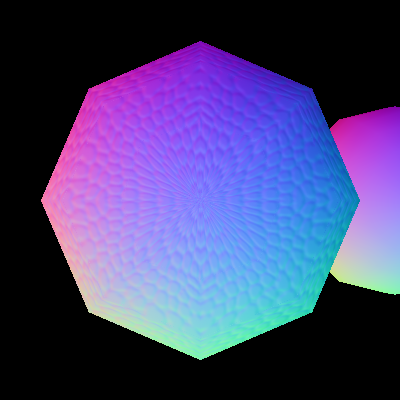
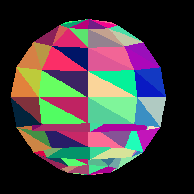 Before I got the flat shading working correctly, I got this. The problem here is that I added the Red, Green, and Blue components of the color together without rounding first. While it was a silly problem, it lead to a cool picture.
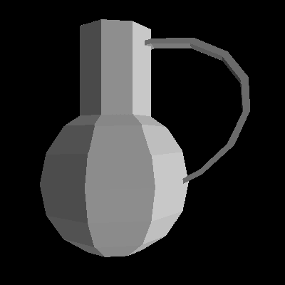
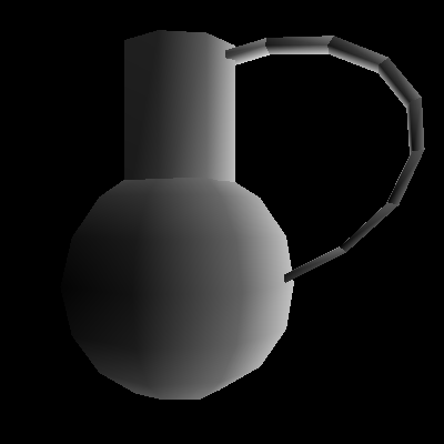
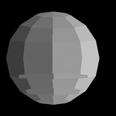 Once I got the sphere working, I tried adding flat shading. This required calculating the normal vector for the polygon (a simple cross product of 2 edges) and then dotting that with an arbitrary light vector. This was the final result.
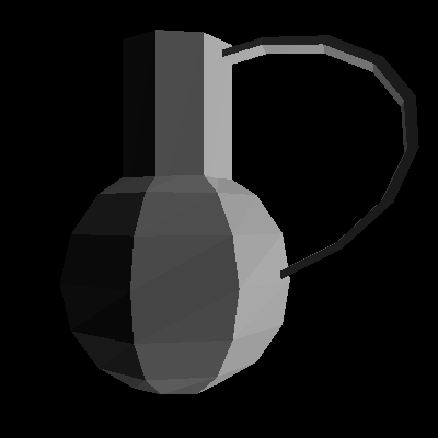
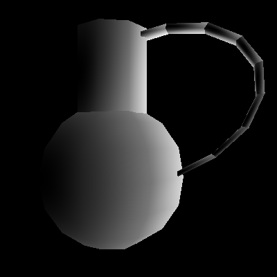
 In the last picture, you can see artifacts on the bottom half of the sphere. This is in fact the only part of the picture where the polygons from the front were drawn on top of the polygons in the back. This error is fixed with z-Buffering; complexities will be discussed next.
The difficulty of z-Buffering is that to find the z-location of a pixel given 3 points, 3 heights, and a fourth point. This is called linear interpolation, but in this case I have to do it in 2 dimensions. This technique of linear interpolation across a polygon is reused throughout the rendering engine.
Improving The Model and Lighting
 Once I got the flat shading done, i was able to examine my model. I decided that a sphere wasn't sufficient to show all of the sweetness of my rendering engine, so I built myself a more complex model in the shape of a water jug at my house. I figured my pictures weren't hot enough yet for a teapot.
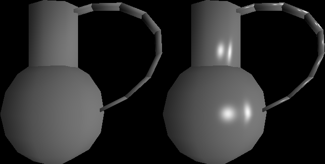
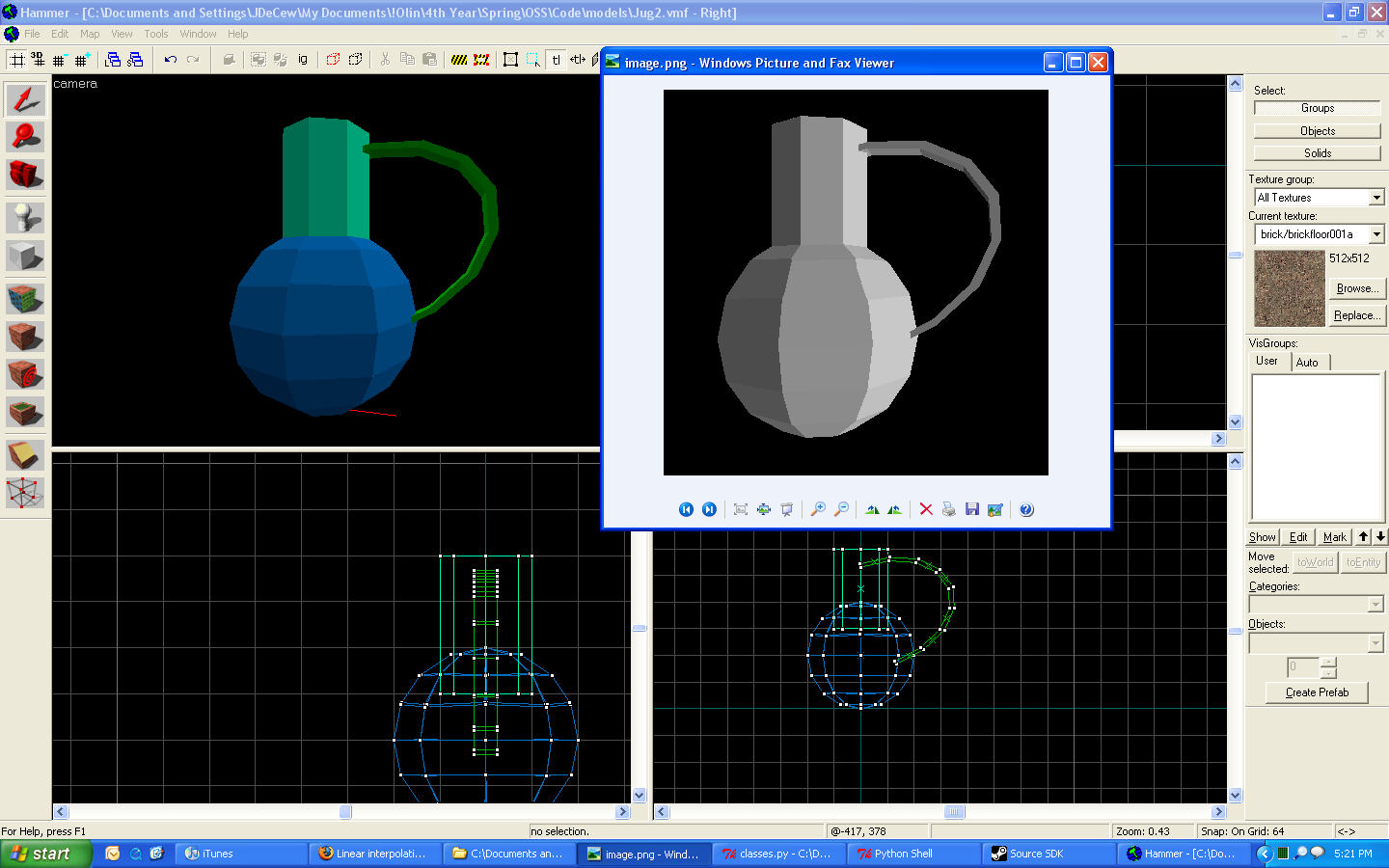 Here I've included a side-by-side of the jug as seen in my renderer, and the jug as seen in the Hammer editor. I wish I had colors, but they are coming soon!
 Next I did a big overhaul of lighting. Previously light was calculated as a dot product of the normal and a random vector. I updated the code to use a real 3d point of a light source, and transform and use that in the light calculations.
Gouraud Shading
 Next, I implemented Gouraud shading. The idea behind Gouraud shading is interpolating vertex colors across the polygon. Vertex colors are calculated by using vertex normals instead of polygon normals, but those vertex normals are calculated as an average of adjacent polygon normals. That makes it smooth.
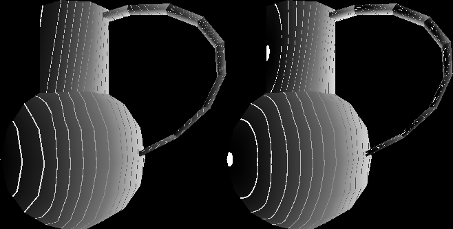
 But not as smooth as that first picture makes it seem. The problem with that picture (and all before that, unfortunately) was that my dot-product method was broken, and it did not calculate vertical lighting correctly. In this picture it's still reasonably easy to see where the polygons are.
Phong Shading
 Next I implemented Phong diffuse shading. The difference here is that instead of calculating colors at the vertices, and interpolating those, I interpolate the normal vector and calculate the light at each point from that. For diffuse lighting, this is only moderately improved from Gouraud shading.
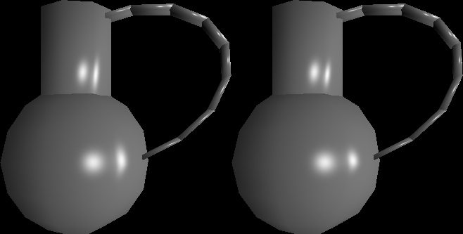
 This picture is to show the improved "smoothness" of Phong shading (right) over Gouraud shading (left). Notice that the lines in the Phong model are curved where the Gouraud lines are straight except at edges.
Phong Specular Lighting
 Next I implemented Phong specular lighting. This is done by dotting the reflection of the light off the surface with the direction of the observer from the surface. Then I take that result and raise it to a high power that makes it shiny only near the reflection point.
 Here I've implemented the Blinn-Phong (right) simplification of the standard Phong (left) specular term. The Blinn-Phong simplification uses an approximation of reflection, but the result is actually smaller, so a factor of 4 increase of the exponent was required to make it look similar. This factor is likely to vary depending on circumstances.
Colors!
 In this photo, you can see that I have added color to each of the lights. This was done as quickly as possible by setting it so that a color is an arithmetic class that can be added and multiplied. That way the equations required no change.
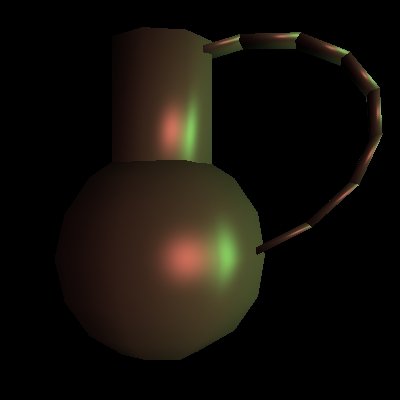
 Unfortunately, only the color of the lights can be set right now, not the objects. In this picture the color is bright enough that the red and green saturate on their spectral glares. This causes the small components of the other colors to magnify and become solid white by the center of the glare.
I'll be working on making this look more realistic, perhaps by removing it altogether.
Unfortunately, only the color of the lights can be set right now, not the objects. In this picture the color is bright enough that the red and green saturate on their spectral glares. This causes the small components of the other colors to magnify and become solid white by the center of the glare.
I'll be working on making this look more realistic, perhaps by removing it altogether.
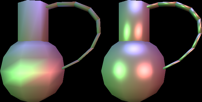
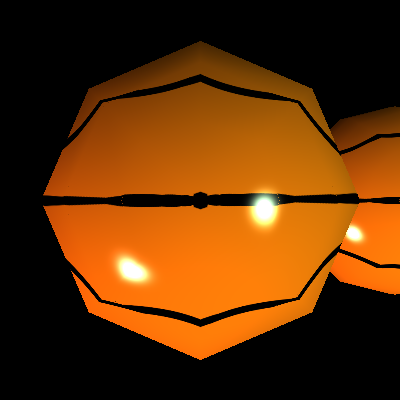
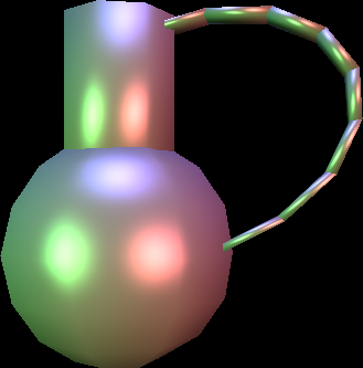 Here I've included 3 lights and it makes a much more pleasant overall image color.
 Here I've included 3 lights and rendered in Gouraud and Phong, both with specular lighting. Each light illustrates the problems with Gouraud specular lighting: The green reflection looks too big because the reflection point is right on the vertex. The red reflection is about the right size but not nearly intense enough at its center. Finally, the blue light isn't even there because it's reflection never touches a vertex.
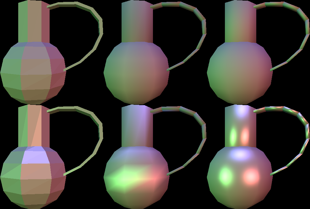 Here I have shown 6 of the rendering modes I have implemented. From left to right, Flat, Gouraud, and Phong. The top is diffuse only and the bottom is diffuse with specular. These all use the Phong specular equation, as opposed to the Blinn-Phong specular equation.
New Model - Hot Enough for a Teapot
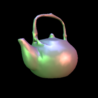
 Here is a new model! It looks super pretty. I actually don't remember where I got the model (sorry), but it came in a DXF format. I then imported the DXF into Blender and exported an X3D format file. Then I had to import that into my program... It was a pain.
 It took a lot of work to get this teapot imported into my program. There were quite a few problems. For one, there were a bunch of polygons that had 2 or more vertices in the same location. Also, there were a ton of repeated vertices which had to be removed.
 The teapot took 25 seconds to parse. Then it took 85 seconds to render. This is a significant increase over the colorless jug both because colors take more computation, and because I added a third light. (Eventually I fixed a bug in the parsing which sped it up significantly by decreasing the amount of searching required in duplicate checking.)
Diffuse Lighting - The Lambert Term
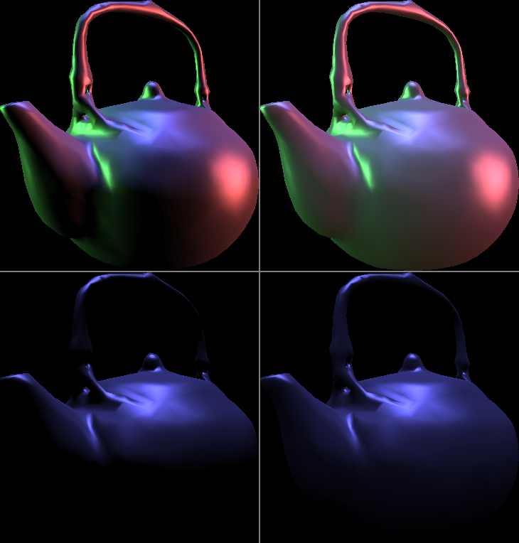 Up until now I have secretly been using a form of lighting Valve uses since HL2: EP1 called Half-Lambert diffuse lighting (right). Basically it makes the diffuse light wrap around the object more. You can see the difference compared to the typical Lambertian term (left) where the blue only goes half-way down the teapot (or in the top image where there is no light in the center).
These gross dark patches are usually fixed with ambient lighting, but the Half-Lambert term makes that less vital.
Up until now I have secretly been using a form of lighting Valve uses since HL2: EP1 called Half-Lambert diffuse lighting (right). Basically it makes the diffuse light wrap around the object more. You can see the difference compared to the typical Lambertian term (left) where the blue only goes half-way down the teapot (or in the top image where there is no light in the center).
These gross dark patches are usually fixed with ambient lighting, but the Half-Lambert term makes that less vital.
 In this picture I did a fill in paint with a dark gray. This accentuates the fact that the color from a light covers more of the object in the Half-Lambert.
Texturing
 I've implemented textures and texture mapping, which allowed me to paste this GI-Joe image onto the front face of a cube. For now, texture coordinates must be manually added to each triangle. I'm not likely to do too much work automating the mapping process until much (much) later. Link for Comparison
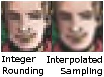 I've added the possibility of texture interpolation. Here is a side-by-side example of the benefits of interpolation versus rounding. While it can't add any information to the texture, it can drastically improve its smoothness, especially in textures with high contrast edges.
 The texture I've applied is 78x78 pixels, which is much smaller than it appears in the photo on the right. In the left photo, it is easy to see where the pixel boundaries are, because it is doing integer rounding to sample the texture. I've added an interpolation to make the image look smooth even in cases like this, when you are over sampling a texture.
Perspective Correct Texture Mapping
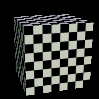
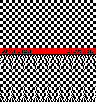
 Due the the fact that I have used the "wrong" kind of interpolation (simple 2d interpolation) this cube looks like it is bowing in on the top and left, and it is bulging out in the front. I'm reading a bunch of articles to figure out how to fix this, but it looks like it won't be that hard, since I have allowed myself to use floating-point numbers.
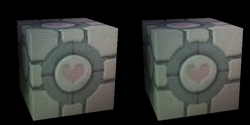
 I have implemented perspective correct texture mapping!
The cube has flat sides now!
I have implemented perspective correct texture mapping!
The cube has flat sides now!
Texturing a Sphere
 I've textured the sphere! I actually chose a basketball very deliberately; I'm planning on adding reflectivity maps and a bump map to the basketball, which will make it look less like a painted marble and more like a real basketball.
 Here I've mapped the grid onto the sphere. As you can see, it is still bent, even with the perspective correct texture mapping! What's wrong? Well, it turns out that mapping a texture onto a trapezoid is a lot harder than mapping a texture onto a rectangle. Especially when the trapezoid is two dissimilar triangles.
 I fixed the problem, but it's not the way I wanted to solve it. However, the way I fixed it was actually much closer to the way the problem is normally solved. I had been trying to sample the ideal texture on the fly, but what is normally done is to create a texture for the specific low-level polygon. Thus I created a filter that morphs the ideal texture to fit the exact polygon shape.
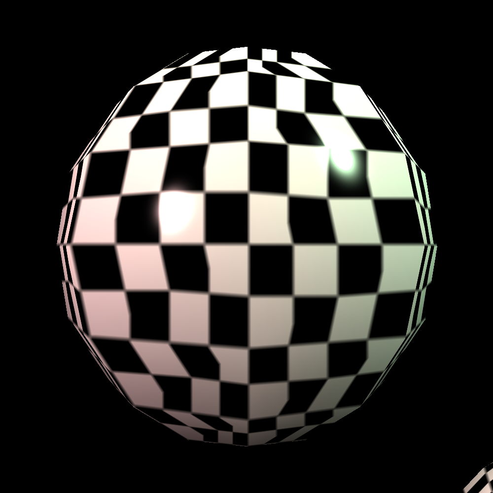
Attribute Mapping - Phong Exponent
 I've added Phong exponent mapping. In this example, I've masked the Phong exponent with the checker texture. This makes all the black squares have a low exponent; a low exponent will reflect light at greater angles. When I start adding bump-mapping and other types of maps which increase the visible detail, It will make more sense why this is useful.
Normal Mapping
 This is the basketball from the top, under normal Phong shading. In this situation, the normal vector has been calculated from the geometry, without any regard to the textures mapped onto it.
.png) This is the basketball from the top, but instead of using the geometric normal, it's using a normal map, pasted onto the shape. One artifact to notice is a small streak coming out of the right-hand glare. This normal map is 300x150.
This is the basketball from the top, but instead of using the geometric normal, it's using a normal map, pasted onto the shape. One artifact to notice is a small streak coming out of the right-hand glare. This normal map is 300x150.
.png) Here, it's the same kind of map pasted onto the basketball, but I've increased the resolution to 1000x500, which removes the artifact.
Here, it's the same kind of map pasted onto the basketball, but I've increased the resolution to 1000x500, which removes the artifact.
.png) Here is the normal vector painted onto the ball and encoded as a color. This is the low-resolution texture, and if you look closely you can see an artifact in the same place as before.
Here is the normal vector painted onto the ball and encoded as a color. This is the low-resolution texture, and if you look closely you can see an artifact in the same place as before.
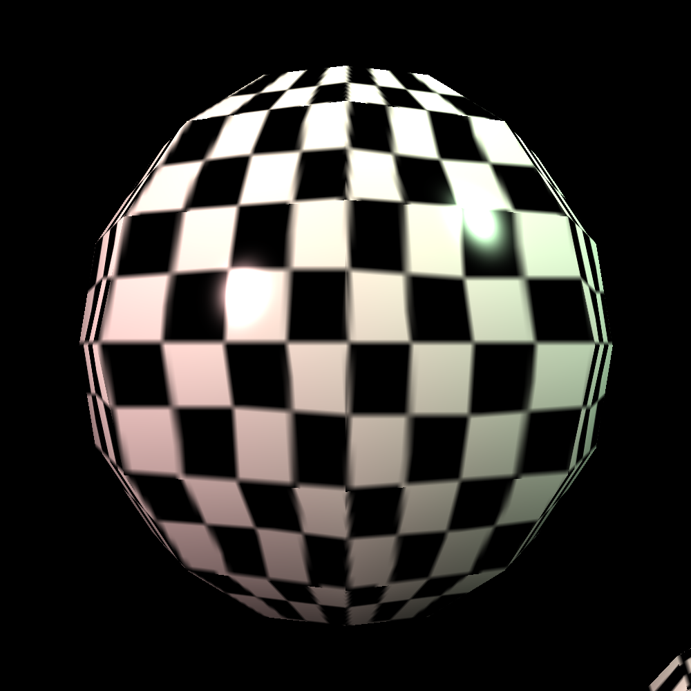
Texture Filtering Progressions
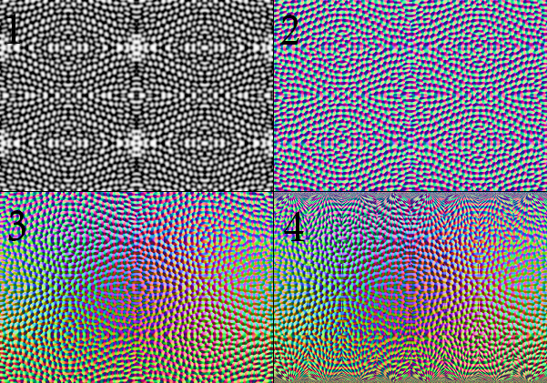
 Here I am filtering a texture before applying it to the sphere so that it does not end up distorted. The problem was that mapping a rectangular texture onto a trapezoidal polygon results on horrible distortion. This fixes that by making the shapes geometrically similar.
 Here is the progression of filters I developed for my textures.
1) A flat height map. All parts of this shape are at medium height. Black would be low heights and white would be high.
2) A flat normal map. Here I am showing the x derivative in red, the y derivative in green, and their cross product in blue.
3) A flat global normal map. Here I take the local vector and I rotate it to be within the frame of the primitive as a whole (instead of the polygon).
4) Here I add perspective mapping fixes, just like the last image.
 Here is the same progression for a "basketball" texture:
1) Height Map: white are peaks, black are valleys.
2) Normal Map: Red is pixel right, Green is pixel up, Blue is pixel out.
3) Global Normal Map: Red is shape right, Green is shape up, Blue is shape out.
4) Filtered to fit the sphere.
Normal Mapped Basketball
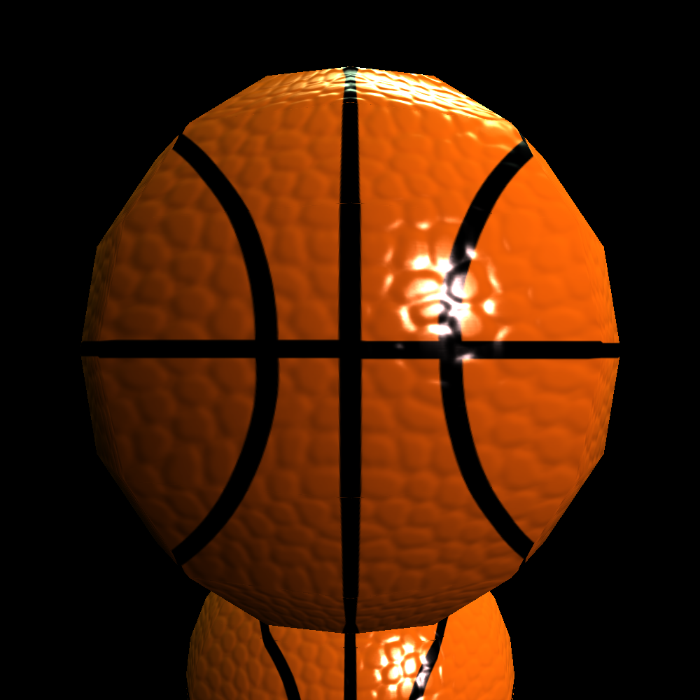
 Here is my first textured basketball. It's a top-down view. There are a number of artistic problems with this picture, not the least of which is that the bumps are HUGE and DEEP. That said, the rendering works!
 I started to work on the image's aesthetics one aspect at a time.
I first tried to increase the size of the glare by reducing alpha from 100 to 50. That was an improvement.
I started to work on the image's aesthetics one aspect at a time.
I first tried to increase the size of the glare by reducing alpha from 100 to 50. That was an improvement.
 Next I tried to make the bumps have a much less flat on top. This was to make them look more like hemispheres, but I overdid it and only succeeded in doing was making it look like a spikey ball.
 I tried to go back a bit, and found a bit of a middle ground where the bumps are still a bit flat, but there's more rounding and space between them.
Improved Basketball
 I decreased the apparent depth of the contours on the basketball's surface, thus improving the aesthetics greatly. As you can see, the black lines still have the bumpy texture, because I have not yet had a change to remove it.
 Here's the ball with the normal color-mapped onto it. This view turns out to be really useful when trying to figure out if the contours and angles in the normal map are reasonable.
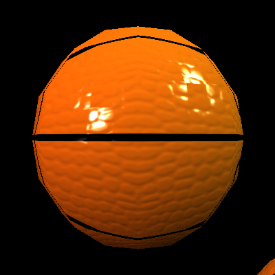
 This is the standard side view which looks much better. It shows off the typical basketball pattern, and the bumps are more even. It also has the benefit of showing a highlight on the vinyl seam.
 I got rid of the bumps on the seams. Now they shine in their own style.
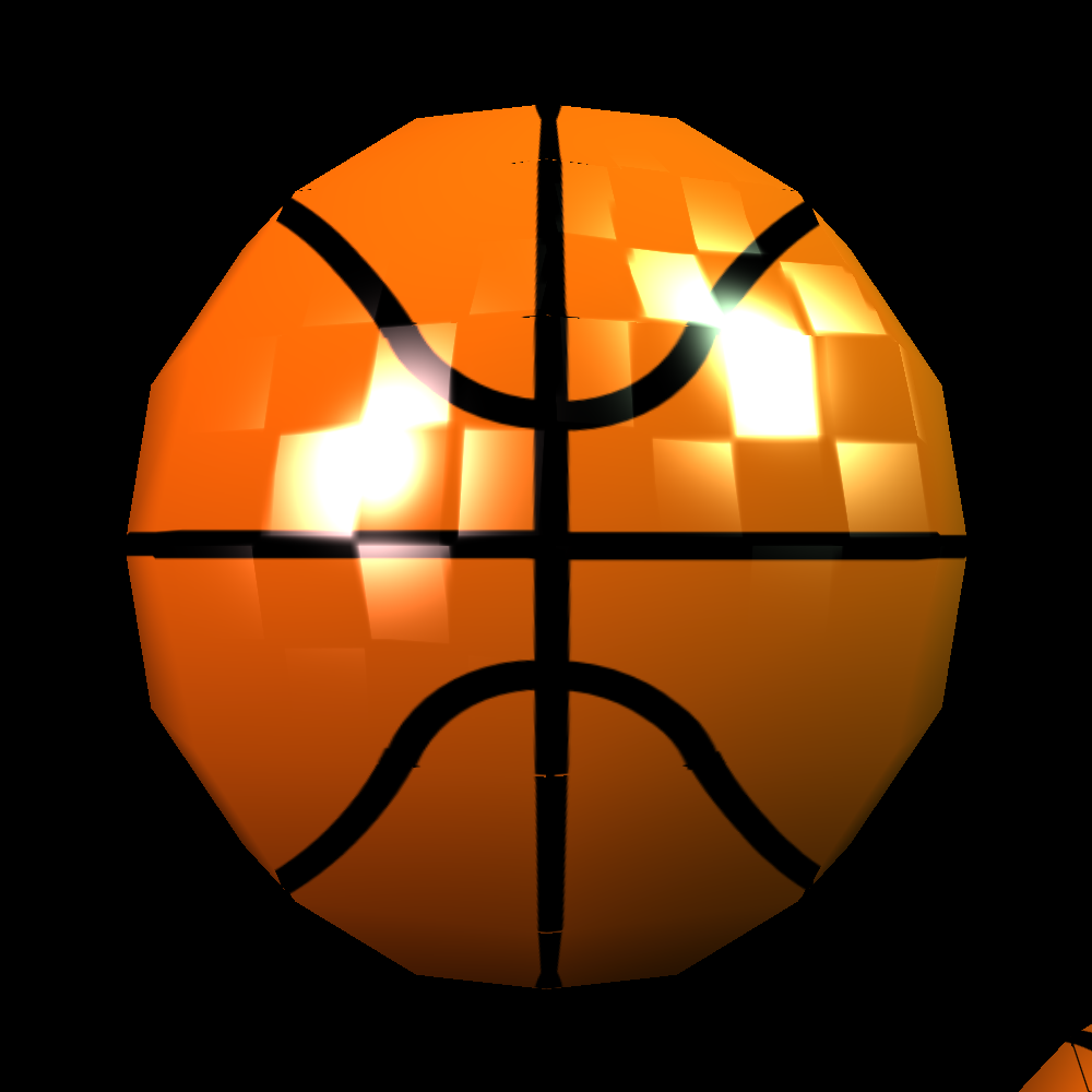
More Attribute Mapping - Specular Mask
 I put a specular or Phong mask on this ball. it's the checkerboard, so where the checker-ball is black, this one has no specular highlight. This will be useful is removing the specular reflection in the matte valleys of the bumps on the basketball.
Skyboxes & Large Scene Rendering
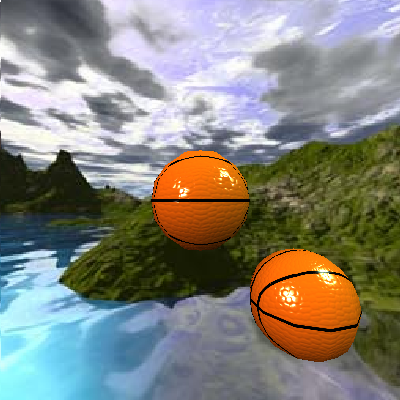 I added a new feature: skyboxes! Now my basketballs can enjoy a nice day at the beach... This was a result of trying to deal with out-of-view shapes, and in solving this problem, I solved a lot of bugs. Skyboxes found here.
 I had a bug in my skyboxes that prevented its texture from being interpolated. Since the texture is quite small, it make the end result very unpleasant looking. Here I have fixed that problem and changed the view to show the bottom-back-right corner of the skybox. Wondering how you can tell? Hopefully you can't... that's the point of skyboxes.
 In this picture, I've shown a rendering of a random level I found online called chain_cannon. This level and other examples I may user can be found here. This picture is a slight cheat, because i've put the camera far enough back that everything is in front of the camera. That way my overzealous polygon clipping doesn't take out the floor and parts of the ceiling.
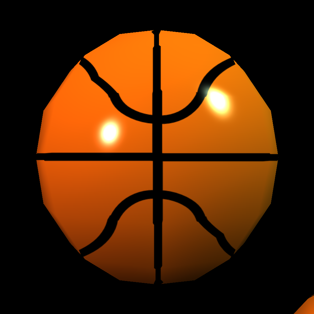
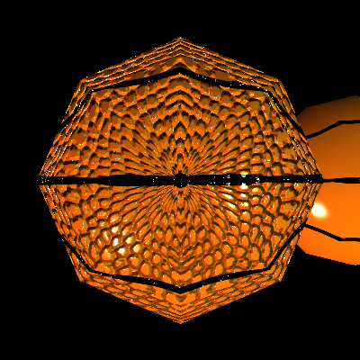
Reflection Mapping
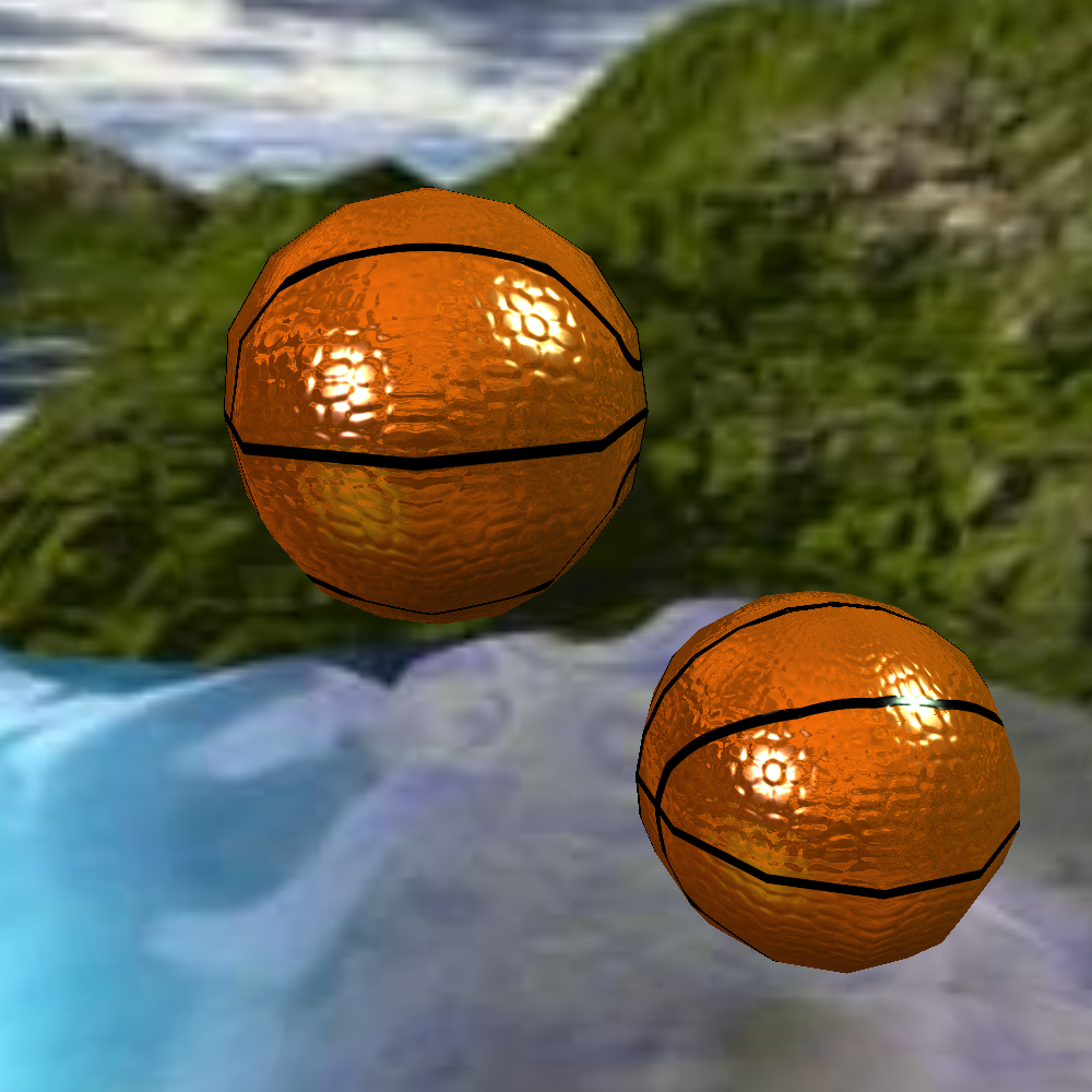
 I added reflection! This particular reflection is called environment mapping, because you can't see any details in the reflection, just the environment. This is the kind of reflection you'd see on the lens of your sniper rifle's scope.
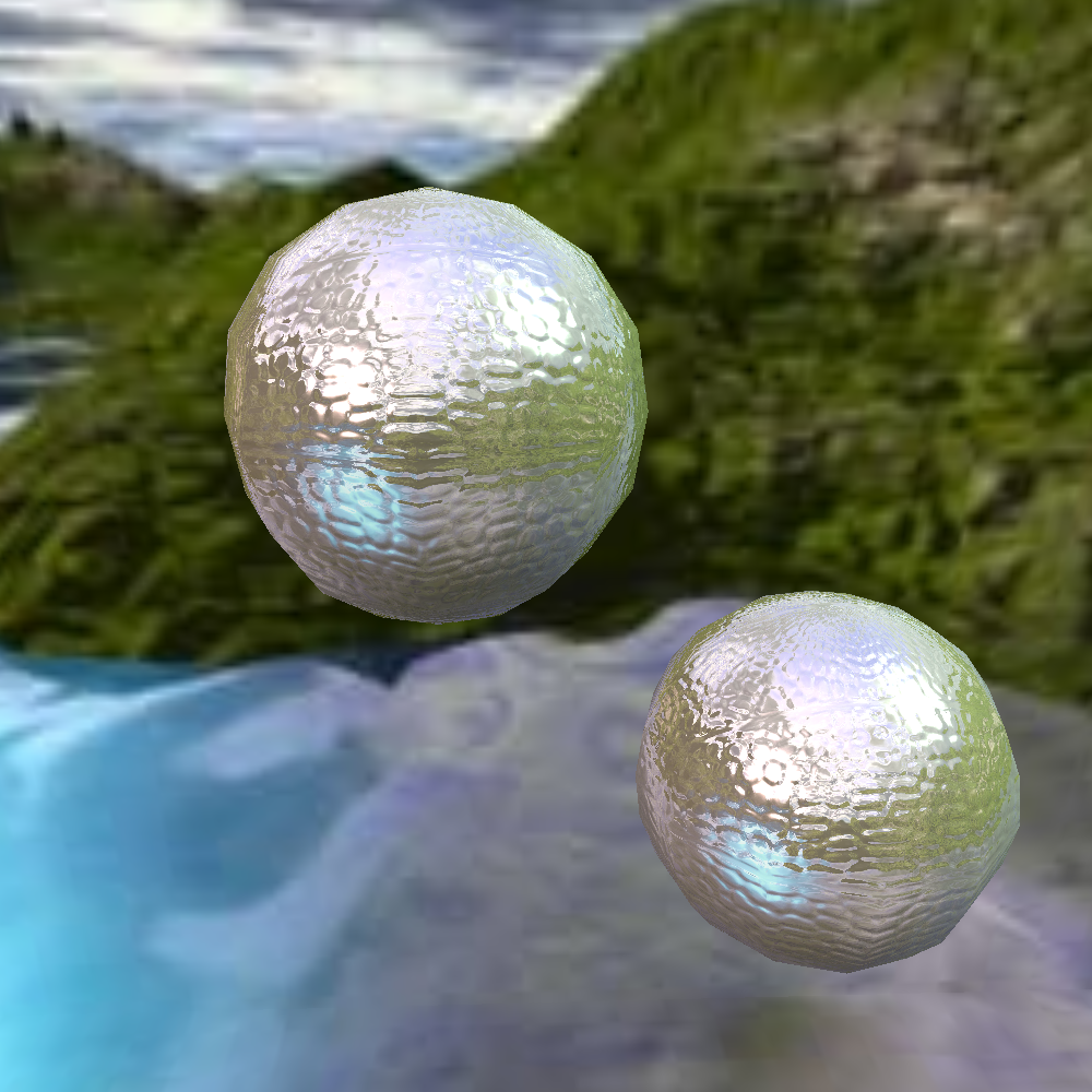 The way I chose to implement reflection, it calculates the reflection vector for every pixel (which is actually already done for Phong shading) and determines the part of the skybox that vector points to. Then it shows that color. This method means that normal maps will effect the reflection, which is totally sweet.
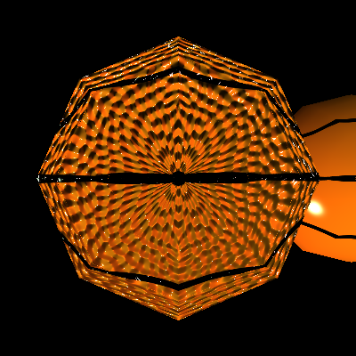
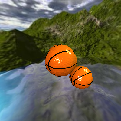
 So once I got reflection working, I had to decide how to combine it with the texture. I tried a lot of different options, but this was the best. First, I calculate the lighting from the shader model. Then I (weighted) average that lighting with the environment map. Only then do I multiply those lighting terms by the texture.
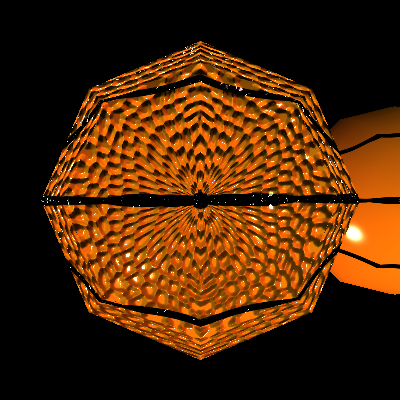
 Looking at this, I realize that I have provided myself with no way to mask reflections. For example, the basketball may reflect well on the tops of the bumps, but not between them. In the case of the basketball this is the same as the Phong mask, so I could use that, but I don't know if that generally holds true.
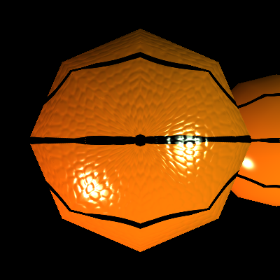
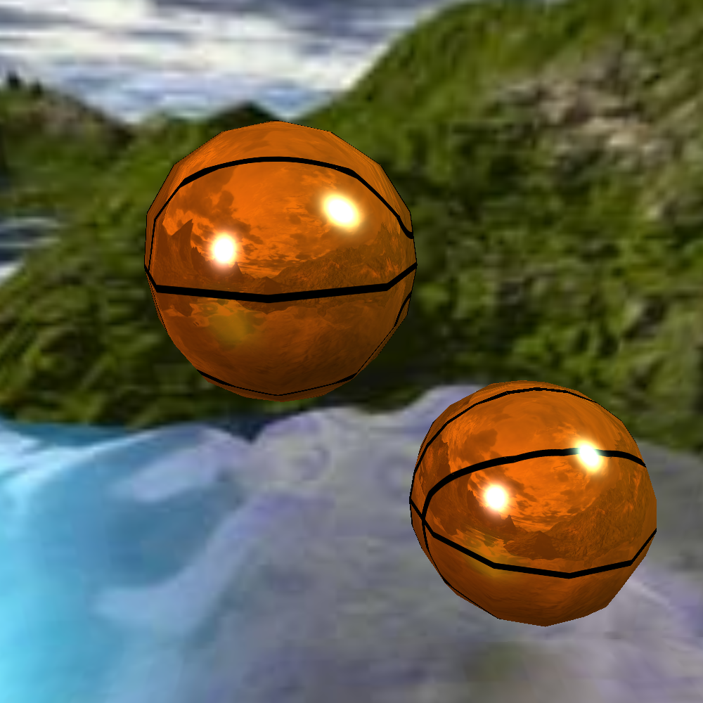
Fresnel Lighting Mask
 Alyx Scale.png) One of the visual components used by Valve in their rendering is a fresnel term. The fresnel term is used to create an effect called "rim lighting" where reflections are greater at grazing angles. This effect is useful in games at ensuring that characters are easily visible against their backgrounds.
One of the visual components used by Valve in their rendering is a fresnel term. The fresnel term is used to create an effect called "rim lighting" where reflections are greater at grazing angles. This effect is useful in games at ensuring that characters are easily visible against their backgrounds.
 Fresnel=Alyx.png) Here I have implemented and applied the fresnel lighting mask, which means that the specular highlights are weaker toward the center of the ball.
Here I have implemented and applied the fresnel lighting mask, which means that the specular highlights are weaker toward the center of the ball.
.png)
.png)